6 Supervised Learning - Advanced Topics
6.1 Introduction
In Section 1.3, we introduced the concept of supervised learning, where we train models using labeled data consisting of input features \(X\) and their associated output values \(y\). We have explored several fundamental supervised learning models, including linear regression, gradient descent optimization, polynomial regression with regularization, and logistic regression for classification tasks.
However, building an effective machine learning model involves much more than just selecting an algorithm and training it on data. In practice, we need to make many important decisions: How do we measure whether our model is performing well? How should we split our data to get reliable performance estimates? How do we choose the best values for hyperparameters? How can we diagnose whether our model is overfitting or underfitting?
This chapter addresses these critical questions by covering the essential practical aspects of supervised learning that apply across all models. We will explore performance metrics, data partitioning strategies, cross validation techniques, and methods for hyperparameter tuning. These concepts form the foundation for successfully applying machine learning in practice, regardless of which specific model you choose.
6.2 The Machine Learning Pipeline
Before diving into the details of model evaluation and tuning, we first present an overview of the typical workflow for a supervised learning project. This machine learning pipeline consists of several key stages, as illustrated in Figure 6.1.
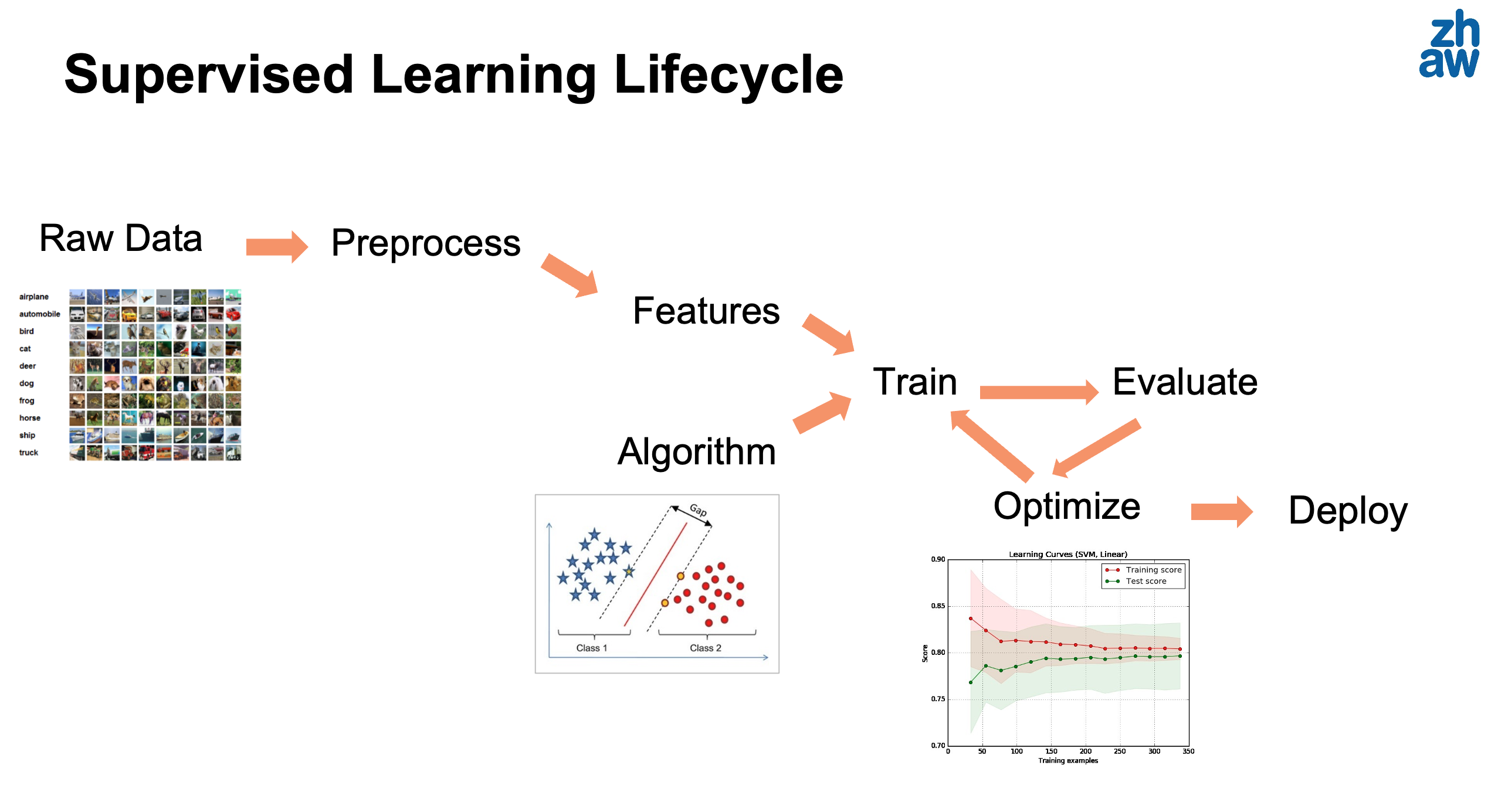
The main stages are:
Data Collection: Gather relevant data for your problem. This might involve collecting measurements, downloading public datasets, or extracting data from databases.
Data Preprocessing: Clean and prepare the data for modeling. This includes handling missing values, removing duplicates, dealing with outliers, and transforming variables as needed.
Feature Engineering: Create or select the most relevant features for your model. This might involve combining existing features, creating polynomial features (as we saw in Section 4.1), or applying domain specific transformations.
Data Partitioning: Split the data into training, validation, and test sets. We will discuss this in detail in Section 6.5.
Model Selection: Choose an appropriate model (or several models to compare) based on your problem type and data characteristics.
Model Training: Fit the model parameters using the training data. This is where algorithms like gradient descent (Section 3.2) are applied.
Model Evaluation: Assess model performance using appropriate metrics on validation and test data. We cover this extensively in Section 6.3.
Hyperparameter Tuning: Optimize hyperparameters (like learning rate \(\alpha\) or regularization parameter \(\lambda\)) to improve model performance. See Section 6.9.
Model Deployment: Once satisfied with the model’s performance, deploy it to make predictions on new, unseen data in a production environment.
It is important to note, as shown in the figure above, that this is not a one-way process. There might be several development or R&D loops where the model evaluation leads to further optimization (and therefore need to re-train). It might also happen that a new algorithm is chosen, or that further preprocessing is needed after we discover edge cases (e.g., studying the worst test data cases) during the model training or evaluation.
Let us now examine each of these stages in more detail, focusing particularly on the evaluation and optimization aspects.
6.3 Performance Metrics for Classification
In Section 1.6.2, we briefly discussed how to evaluate supervised machine learning models using a test set. However, we did not discuss in detail which specific metrics to use for quantifying model quality. The choice of metric depends heavily on the nature of the problem and the relative importance of different types of errors.
For classification problems, we need metrics that capture how well our model assigns the correct class labels to samples. The simplest metric is accuracy, but as we will see, it can be misleading in many practical scenarios.
6.3.1 Accuracy
The most intuitive performance metric for classification is accuracy, which simply measures the fraction of correctly classified samples:
\[\text{Accuracy} = \frac{\text{Number of Correct Predictions}}{\text{Total Number of Predictions}} = \frac{1}{M}\sum_{m=1}^M I(y^{(m)} = \hat{y}^{(m)}) \tag{6.1}\]
where \(I(\cdot)\) is an indicator function that equals 1 if the condition is true and 0 otherwise, \(y^{(m)}\) is the true label, and \(\hat{y}^{(m)}\) is the predicted label for sample \(m\).
While accuracy is easy to understand and compute, it has a significant limitation: it treats all errors equally and can be misleading when classes are imbalanced.
Example: Consider a medical test for a rare disease that affects only 1% of the population. A naive model that always predicts “no disease” would achieve 99% accuracy, yet it would be completely useless for detecting the disease. We need more sophisticated metrics that can capture this nuance.
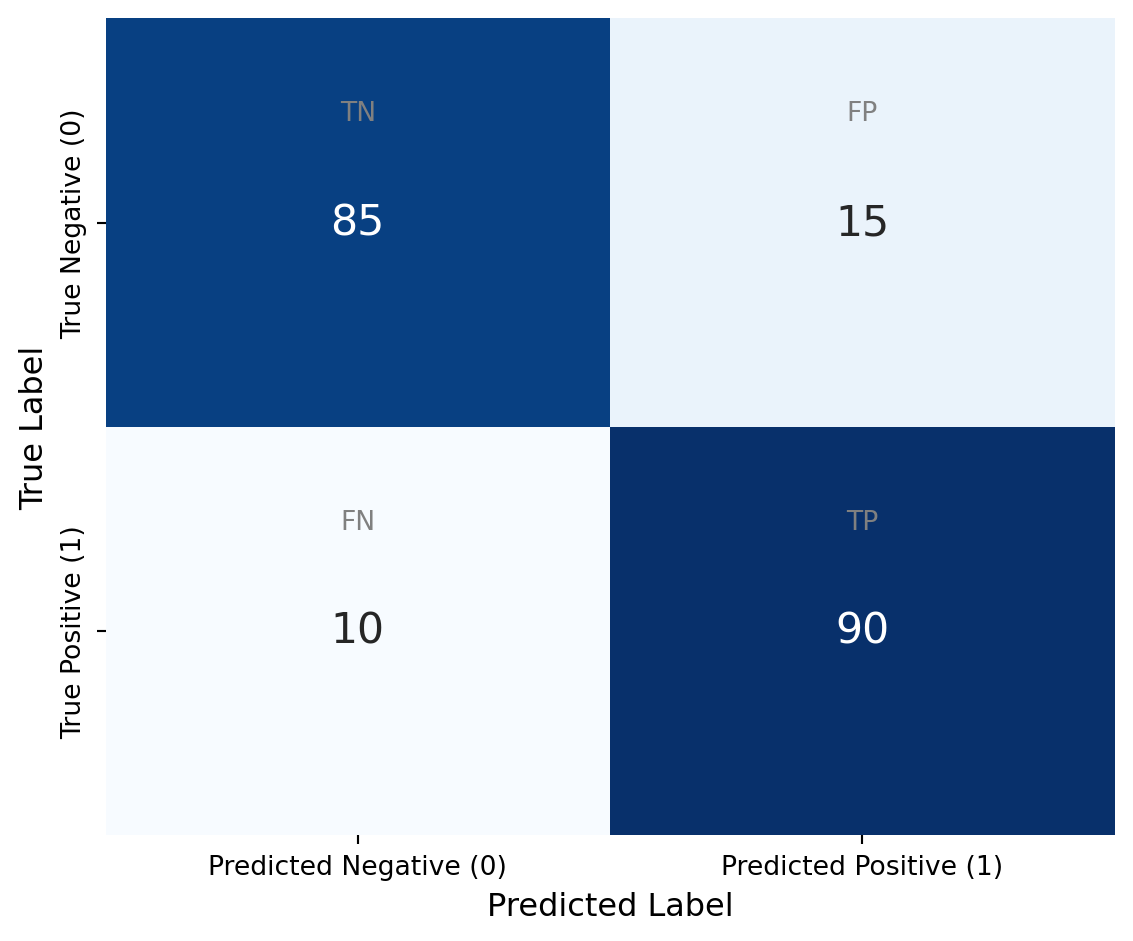
6.3.2 Confusion Matrix
For a binary classification problem with classes 0 (negative) and 1 (positive), we can organize the predictions and actual labels in a confusion matrix as shown in Figure 6.2. The confusion matrix provides a complete picture of how the model’s predictions relate to the true labels.
- \(TP\) (True Positives): samples correctly classified as class 1
- \(TN\) (True Negatives): samples correctly classified as class 0
- \(FP\) (False Positives): samples incorrectly classified as class 1 (also called Type I error)
- \(FN\) (False Negatives): samples incorrectly classified as class 0 (also called Type II error)
The total number of samples is \(M = TP + TN + FP + FN\), and accuracy can be expressed as:
\[\text{Accuracy} = \frac{TP + TN}{TP + TN + FP + FN} \tag{6.2}\]
6.3.3 Precision and Recall
From the confusion matrix, we can derive two important metrics that provide more nuanced information about classifier performance:
Precision (also called positive predictive value) measures the fraction of positive predictions that are actually correct:
\[\text{Precision} = \frac{TP}{TP + FP} \tag{6.3}\]
Precision answers the question: “Of all the samples we predicted as positive, how many were actually positive?” High precision means that when the model predicts positive, it is usually correct.
Recall (also called sensitivity or true positive rate) measures the fraction of actual positive samples that were correctly identified:
\[\text{Recall} = \frac{TP}{TP + FN} \tag{6.4}\]
Recall answers the question: “Of all the actual positive samples, how many did we correctly identify?” High recall means the model successfully finds most of the positive samples.
Example: In the disease detection scenario, precision tells us how many of the patients we diagnosed with the disease actually have it (important to avoid unnecessary treatment), while recall tells us how many of the patients who have the disease were correctly diagnosed (important to avoid missing cases).
There is typically a tradeoff between precision and recall. We can increase recall by predicting more samples as positive, but this usually decreases precision by introducing more false positives.
6.3.4 F1 Score
Since we often want to balance precision and recall, the F1 Score provides a single metric that combines both:
\[F_1 = 2 \cdot \frac{\text{Precision} \cdot \text{Recall}}{\text{Precision} + \text{Recall}} = \frac{2TP}{2TP + FP + FN} \tag{6.5}\]
The F1 score is the harmonic mean of precision and recall. It ranges from 0 to 1, where 1 indicates perfect precision and recall. The harmonic mean penalizes extreme values more than the arithmetic mean, so a good F1 score requires both precision and recall to be reasonably high.
6.3.5 Specificity and Other Metrics
In addition to recall (true positive rate), we can define the true negative rate or specificity:
\[\text{Specificity} = \frac{TN}{TN + FP} \tag{6.6}\]
Specificity measures how well we identify negative samples. The false positive rate is simply \(1 - \text{Specificity} = \frac{FP}{TN + FP}\).
Let us now examine these metrics with a concrete example:
Code
import numpy as np
from sklearn.metrics import confusion_matrix, precision_score, recall_score, f1_score
import matplotlib.pyplot as plt
import seaborn as sns

# Generate synthetic email classification data
# Class 0: legitimate email, Class 1: spam
np.random.seed(42)
M = 200

# Simulate model predictions (biased toward predicting legitimate)
y_true = np.random.choice([0, 1], size=M, p=[0.7, 0.3])  # 30% spam
# Model is conservative, tends to under-predict spam
y_pred = y_true.copy()
# Introduce false negatives (spam classified as legitimate)
spam_indices = np.where(y_true == 1)[0]
fn_indices = np.random.choice(spam_indices, size=int(0.3 * len(spam_indices)), replace=False)
y_pred[fn_indices] = 0
# Introduce some false positives
legit_indices = np.where(y_true == 0)[0]
fp_indices = np.random.choice(legit_indices, size=int(0.05 * len(legit_indices)), replace=False)
y_pred[fp_indices] = 1

# Compute confusion matrix
cm = confusion_matrix(y_true, y_pred)

# Visualize confusion matrix
fig, (ax1, ax2) = plt.subplots(1, 2, figsize=(12, 5))

sns.heatmap(cm, annot=True, fmt='d', cmap='Blues',
            xticklabels=['Predicted Legitimate', 'Predicted Spam'],
            yticklabels=['True Legitimate', 'True Spam'],
            cbar=False, ax=ax1, annot_kws={"size": 14})
ax1.set_ylabel('True Label', fontsize=11)
ax1.set_xlabel('Predicted Label', fontsize=11)
ax1.set_title('Confusion Matrix', fontsize=12)

# Compute metrics
tn, fp, fn, tp = cm.ravel()
accuracy = (tp + tn) / (tp + tn + fp + fn)
precision = precision_score(y_true, y_pred)
recall = recall_score(y_true, y_pred)
f1 = f1_score(y_true, y_pred)
specificity = tn / (tn + fp)

# Display metrics as bar chart
metrics_names = ['Accuracy', 'Precision', 'Recall', 'F1 Score', 'Specificity']
metrics_values = [accuracy, precision, recall, f1, specificity]

ax2.barh(metrics_names, metrics_values, color=['skyblue', 'lightcoral', 'lightgreen', 'gold', 'plum'])
ax2.set_xlim([0, 1])
ax2.set_xlabel('Score', fontsize=11)
ax2.set_title('Performance Metrics', fontsize=12)
ax2.grid(axis='x', alpha=0.3)

# Add value labels on bars
for i, v in enumerate(metrics_values):
    ax2.text(v + 0.02, i, f'{v:.3f}', va='center', fontsize=10)

plt.tight_layout()
plt.show()

print(f"TP: {tp}, TN: {tn}, FP: {fp}, FN: {fn}")
print(f"Accuracy: {accuracy:.3f}")
print(f"Precision: {precision:.3f}")
print(f"Recall: {recall:.3f}")
print(f"F1 Score: {f1:.3f}")
print(f"Specificity: {specificity:.3f}")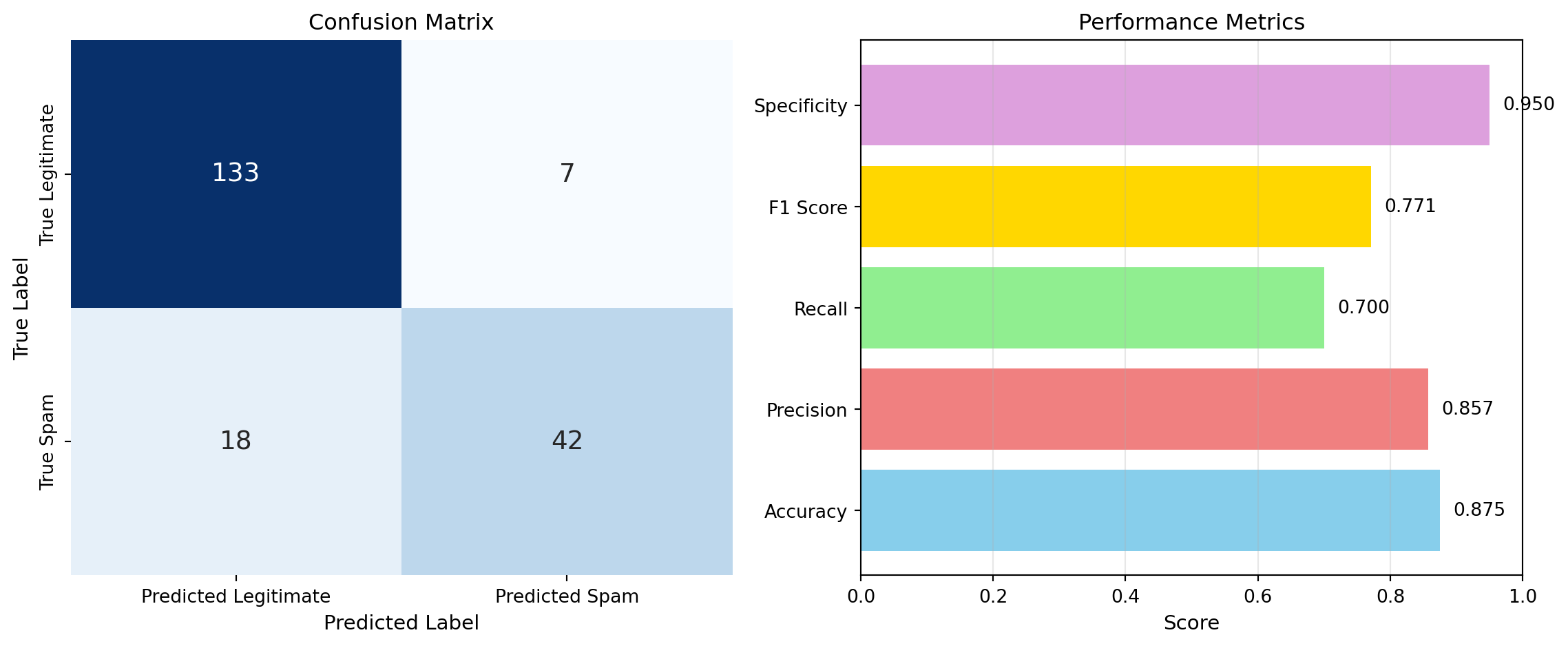
TP: 42, TN: 133, FP: 7, FN: 18
Accuracy: 0.875
Precision: 0.857
Recall: 0.700
F1 Score: 0.771
Specificity: 0.950
From this example, we can see that while the model achieves reasonable accuracy, its recall for spam is lower than its precision. This means the model is missing some spam emails (false negatives) but is relatively reliable when it does predict spam.
6.3.6 Multi-Class Classification Metrics
For multi-class classification problems with \(K > 2\) classes, we can extend these metrics in different ways. For each class \(k\), we can compute precision and recall by treating class \(k\) as the positive class and all other classes as negative.
We then aggregate these per-class metrics using either:
Macro-averaging: Compute the metric independently for each class, then take the average:
\[\text{Precision}_{\text{macro}} = \frac{1}{K}\sum_{k=1}^K \text{Precision}_k \tag{6.7}\]
Micro-averaging: Aggregate the contributions of all classes to compute the average metric. For precision, this is equivalent to overall accuracy:
\[\text{Precision}_{\text{micro}} = \frac{\sum_{k=1}^K TP_k}{\sum_{k=1}^K (TP_k + FP_k)} \tag{6.8}\]
Macro-averaging treats all classes equally, while micro-averaging weights classes by their frequency. For imbalanced datasets, macro-averaging is often preferred as it gives equal importance to each class.
6.4 Performance Metrics for Regression
For regression tasks where the target variable is continuous, we need different metrics that quantify the distance between predicted and actual values.
6.4.1 Mean Absolute Error
The Mean Absolute Error (MAE) measures the average absolute difference between predictions and true values:
\[\text{MAE} = \frac{1}{M}\sum_{m=1}^M |y^{(m)} - \hat{y}^{(m)}| \tag{6.9}\]
MAE is easy to interpret (it has the same units as the target variable) and is robust to outliers because it does not square the errors.
6.4.2 Mean Squared Error
The Mean Squared Error (MSE), which we have seen before in Equation 9.4, is defined as:
\[\text{MSE} = \frac{1}{M}\sum_{m=1}^M (y^{(m)} - \hat{y}^{(m)})^2 \tag{6.10}\]
MSE penalizes large errors more heavily than small errors due to the squaring. This can be useful when large errors are particularly undesirable, but it also makes MSE more sensitive to outliers.
6.4.3 Root Mean Squared Error
The Root Mean Squared Error (RMSE) is simply the square root of MSE:
\[\text{RMSE} = \sqrt{\frac{1}{M}\sum_{m=1}^M (y^{(m)} - \hat{y}^{(m)})^2} \tag{6.11}\]
RMSE has the same units as the target variable (like MAE), making it easier to interpret than MSE, while still penalizing large errors more than MAE does.
6.4.4 R-Squared
The coefficient of determination \(R^2\), which we introduced in Section 2.6.1, measures the proportion of variance in the target variable that is explained by the model. It ranges from negative infinity to 1, where 1 indicates perfect prediction. An \(R^2\) of 0 means the model performs no better than simply predicting the mean value for all samples.
The choice between these metrics depends on your application. Use MAE when you want all errors to be weighted equally. Use RMSE or MSE when large errors are particularly problematic. Use \(R^2\) when you want to understand what fraction of the variance is explained by your model.
6.5 Data Partitioning Strategies
A fundamental principle in machine learning is that we should evaluate our model on data that was not used during training. This allows us to estimate how well the model will generalize to new, unseen data. There are several strategies for partitioning data, each with different purposes.
6.5.1 Train-Test Split
The simplest approach is to split the available data into two disjoint sets:
- Training set: Used to fit the model parameters. Typically 70-80% of the data.
- Test set: Used to evaluate the final model performance. Typically 20-30% of the data.
Mathematically, we partition our dataset \(D = \{(x^{(1)}, y^{(1)}), \ldots, (x^{(M)}, y^{(M)})\}\) into disjoint sets \(D_{\text{train}}\) and \(D_{\text{test}}\) such that \(D_{\text{train}} \cap D_{\text{test}} = \emptyset\) and \(D_{\text{train}} \cup D_{\text{test}} = D\).
The test set provides an unbiased estimate of model performance, but only if it is truly held out and not used for any training decisions. Using the test set to make decisions about model selection or hyperparameter tuning would bias this estimate.
Code
import numpy as np
import matplotlib.pyplot as plt
from sklearn.model_selection import train_test_split

np.random.seed(42)

# Generate synthetic data
M = 100
X = np.linspace(0, 10, M).reshape(-1, 1)
y = 2 * X.ravel() + 1 + np.random.randn(M) * 2

# Split into train and test
X_train, X_test, y_train, y_test = train_test_split(X, y, test_size=0.3, random_state=42)

# Visualize
fig, ax = plt.subplots(figsize=(10, 5))
ax.scatter(X_train, y_train, alpha=0.6, label='Training set (70%)', s=50)
ax.scatter(X_test, y_test, alpha=0.6, label='Test set (30%)', s=50)
ax.set_xlabel('Feature x', fontsize=12)
ax.set_ylabel('Target y', fontsize=12)
ax.legend(fontsize=11)
ax.set_title('Train-Test Split Example', fontsize=13)
plt.tight_layout()
plt.show()

print(f"Total samples: {M}")
print(f"Training samples: {len(X_train)}")
print(f"Test samples: {len(X_test)}")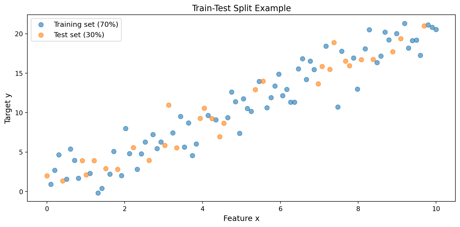
Total samples: 100
Training samples: 70
Test samples: 30
6.5.2 Train-Validation-Test Split
When we need to tune hyperparameters or compare multiple models, a two-way split is insufficient. If we use the test set for these decisions, we risk overfitting to the test set itself. The solution is to create three sets:
- Training set: Used to fit model parameters (60-70% of data)
- Validation set: Used for hyperparameter tuning and model selection (15-20% of data)
- Test set: Used only for final performance evaluation (15-20% of data)
The workflow is as follows:
- Train multiple models (or the same model with different hyperparameters) on the training set
- Evaluate each model on the validation set
- Select the best performing model based on validation performance
- Retrain the selected model on the combined training and validation sets
- Report final performance on the test set
This three-way split ensures that the test set provides an unbiased estimate of generalization performance.
Code
import matplotlib.pyplot as plt
import matplotlib.patches as mpatches

fig, ax = plt.subplots(figsize=(10, 2))

# Draw rectangles for each set
train_rect = mpatches.Rectangle((0, 0), 0.6, 1, linewidth=2,
                                edgecolor='black', facecolor='lightblue', label='Training (60%)')
val_rect = mpatches.Rectangle((0.6, 0), 0.2, 1, linewidth=2,
                              edgecolor='black', facecolor='lightgreen', label='Validation (20%)')
test_rect = mpatches.Rectangle((0.8, 0), 0.2, 1, linewidth=2,
                               edgecolor='black', facecolor='lightcoral', label='Test (20%)')

ax.add_patch(train_rect)
ax.add_patch(val_rect)
ax.add_patch(test_rect)

# Add labels
ax.text(0.3, 0.5, 'Training Set\n(Fit parameters)', ha='center', va='center', fontsize=11, weight='bold')
ax.text(0.7, 0.5, 'Validation Set\n(Tune hyperparameters)', ha='center', va='center', fontsize=11, weight='bold')
ax.text(0.9, 0.5, 'Test Set\n(Final evaluation)', ha='center', va='center', fontsize=11, weight='bold')

ax.set_xlim([0, 1])
ax.set_ylim([0, 1])
ax.axis('off')
ax.set_title('Train-Validation-Test Split', fontsize=13, pad=20)

plt.tight_layout()
plt.show()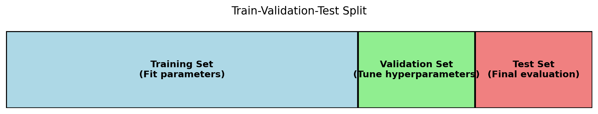
6.5.3 Stratified Splitting
When dealing with classification problems, especially those with imbalanced classes, it is important to maintain the same class distribution in each split. Stratified splitting ensures that each subset (train, validation, test) has approximately the same proportion of samples from each class as the original dataset.
For example, if 30% of your samples belong to class 1 and 70% to class 0, stratified splitting will ensure that each split maintains this 30-70 ratio. This is particularly important for small datasets or highly imbalanced problems, where random splitting might accidentally create subsets with very different class distributions.
Code
import numpy as np
import matplotlib.pyplot as plt
from sklearn.model_selection import train_test_split

np.random.seed(42)

# Create imbalanced dataset (80% class 0, 20% class 1)
M = 100
y = np.concatenate([np.zeros(80), np.ones(20)])
X = np.random.randn(M, 2)

# Random split
X_train_rand, X_test_rand, y_train_rand, y_test_rand = train_test_split(
    X, y, test_size=0.3, random_state=42, stratify=None)

# Stratified split
X_train_strat, X_test_strat, y_train_strat, y_test_strat = train_test_split(
    X, y, test_size=0.3, random_state=42, stratify=y)

# Calculate class distributions
def class_distribution(y_set):
    return np.sum(y_set == 1) / len(y_set)

# Visualize
fig, axes = plt.subplots(1, 3, figsize=(15, 4))

# Original data
axes[0].bar(['Class 0', 'Class 1'], [0.8, 0.2], color=['lightblue', 'lightcoral'])
axes[0].set_ylim([0, 1])
axes[0].set_ylabel('Proportion', fontsize=11)
axes[0].set_title('Original Dataset', fontsize=12)
axes[0].grid(axis='y', alpha=0.3)

# Random split
train_dist_rand = [1 - class_distribution(y_train_rand), class_distribution(y_train_rand)]
test_dist_rand = [1 - class_distribution(y_test_rand), class_distribution(y_test_rand)]
x = np.arange(2)
width = 0.35
axes[1].bar(x - width/2, train_dist_rand, width, label='Train', color=['lightblue', 'lightcoral'], alpha=0.7)
axes[1].bar(x + width/2, test_dist_rand, width, label='Test', color=['blue', 'red'], alpha=0.7)
axes[1].set_ylim([0, 1])
axes[1].set_xticks(x)
axes[1].set_xticklabels(['Class 0', 'Class 1'])
axes[1].set_ylabel('Proportion', fontsize=11)
axes[1].set_title('Random Split', fontsize=12)
axes[1].legend()
axes[1].grid(axis='y', alpha=0.3)

# Stratified split
train_dist_strat = [1 - class_distribution(y_train_strat), class_distribution(y_train_strat)]
test_dist_strat = [1 - class_distribution(y_test_strat), class_distribution(y_test_strat)]
axes[2].bar(x - width/2, train_dist_strat, width, label='Train', color=['lightblue', 'lightcoral'], alpha=0.7)
axes[2].bar(x + width/2, test_dist_strat, width, label='Test', color=['blue', 'red'], alpha=0.7)
axes[2].set_ylim([0, 1])
axes[2].set_xticks(x)
axes[2].set_xticklabels(['Class 0', 'Class 1'])
axes[2].set_ylabel('Proportion', fontsize=11)
axes[2].set_title('Stratified Split', fontsize=12)
axes[2].legend()
axes[2].grid(axis='y', alpha=0.3)

plt.tight_layout()
plt.show()

print(f"Original: Class 1 proportion = {class_distribution(y):.3f}")
print(f"Random split - Train: {class_distribution(y_train_rand):.3f}, Test: {class_distribution(y_test_rand):.3f}")
print(f"Stratified split - Train: {class_distribution(y_train_strat):.3f}, Test: {class_distribution(y_test_strat):.3f}")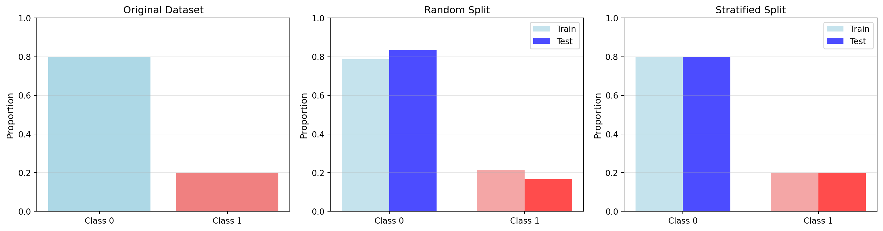
Original: Class 1 proportion = 0.200
Random split - Train: 0.214, Test: 0.167
Stratified split - Train: 0.200, Test: 0.200
6.6 Cross Validation
A limitation of the simple train-test split is that the performance estimate can be highly dependent on which particular samples end up in the test set. With small datasets, this randomness can lead to unreliable performance estimates. Cross validation addresses this issue by repeatedly splitting the data in different ways and averaging the results.
6.6.1 K-Fold Cross Validation
In K-fold cross validation, we divide the dataset into \(K\) equally sized folds (subsets). We then train and evaluate the model \(K\) times, each time using a different fold as the test set and the remaining \(K-1\) folds as the training set. This procedure is illustrated in Figure 6.7.
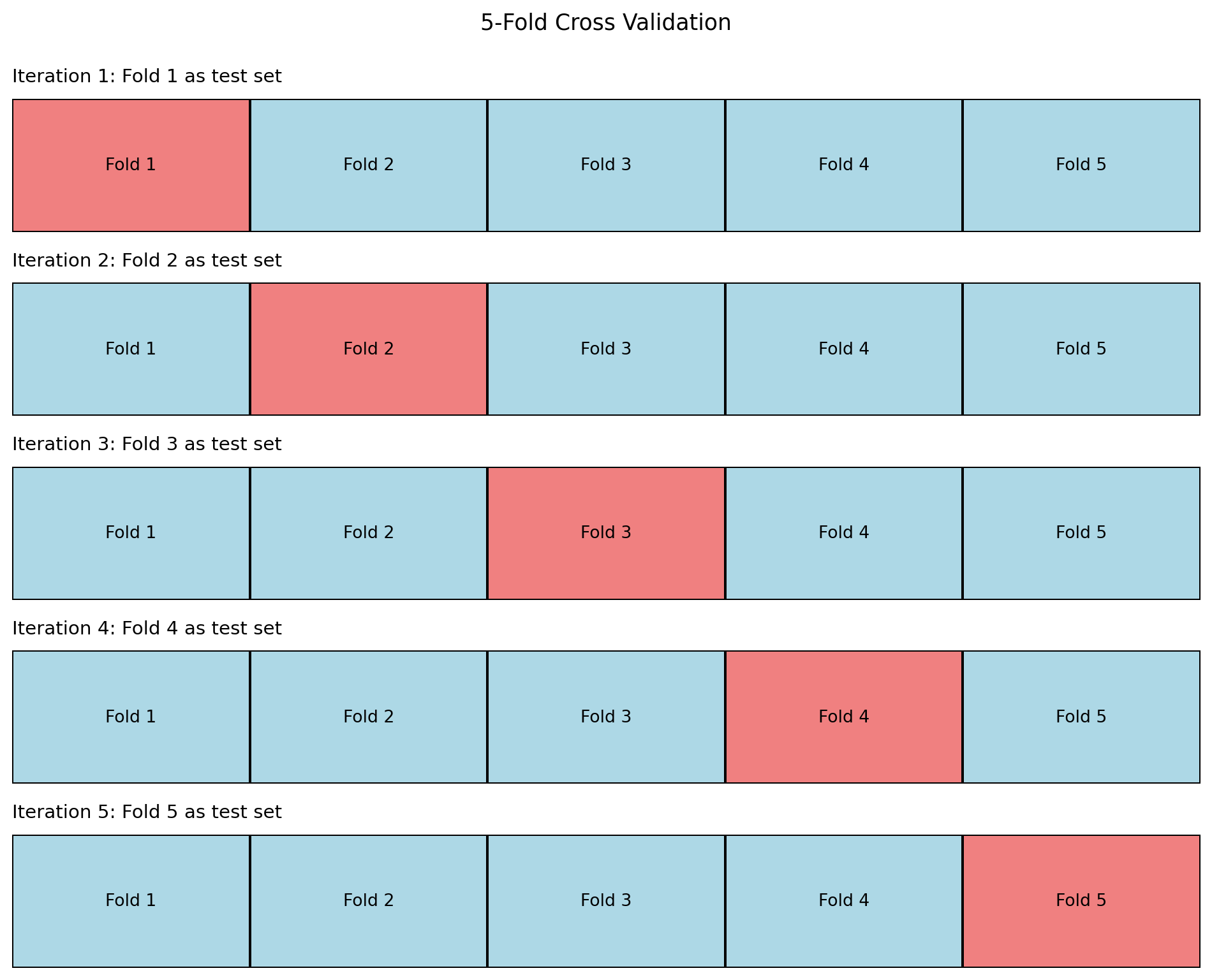
The algorithm for K-fold cross validation is:
- Shuffle the dataset randomly
- Split the dataset into \(K\) folds of approximately equal size
- For each fold \(k = 1, \ldots, K\):
- Use fold \(k\) as the test set
- Use the remaining \(K-1\) folds as the training set
- Train the model on the training set
- Evaluate the model on the test set, recording the performance metric (e.g., accuracy, MSE)
- Calculate the average performance across all \(K\) iterations
Mathematically, if we denote the performance metric in iteration \(k\) as \(P_k\), the cross validation estimate is:
\[P_{\text{CV}} = \frac{1}{K}\sum_{k=1}^K P_k \tag{6.12}\]
We can also compute the standard deviation of the \(K\) performance values to assess the variability:
\[\sigma_{\text{CV}} = \sqrt{\frac{1}{K}\sum_{k=1}^K (P_k - P_{\text{CV}})^2} \tag{6.13}\]
Common choices for \(K\) are 5 or 10. Larger values of \(K\) provide more reliable estimates but require more computation. In the extreme case where \(K = M\) (the number of samples), we have leave-one-out cross validation, discussed next.
Code
import numpy as np
import matplotlib.pyplot as plt
from sklearn.model_selection import cross_val_score, KFold
from sklearn.linear_model import LinearRegression
from sklearn.preprocessing import PolynomialFeatures
from sklearn.pipeline import make_pipeline

np.random.seed(42)

# Generate synthetic data
M = 100
X = np.linspace(0, 10, M).reshape(-1, 1)
y = 2 * X.ravel() + 1 + np.random.randn(M) * 3

# Create model (polynomial regression of degree 2)
model = make_pipeline(PolynomialFeatures(degree=2), LinearRegression())

# Perform 5-fold cross validation
K = 5
kfold = KFold(n_splits=K, shuffle=True, random_state=42)
scores = cross_val_score(model, X, y, cv=kfold, scoring='r2')

# Visualize results
fig, (ax1, ax2) = plt.subplots(1, 2, figsize=(14, 5))

# Plot individual fold scores
ax1.bar(range(1, K+1), scores, color='steelblue', alpha=0.7)
ax1.axhline(y=np.mean(scores), color='red', linestyle='--', linewidth=2, label=f'Mean: {np.mean(scores):.3f}')
ax1.set_xlabel('Fold Number', fontsize=11)
ax1.set_ylabel('R² Score', fontsize=11)
ax1.set_title('Performance Across Folds', fontsize=12)
ax1.legend()
ax1.grid(axis='y', alpha=0.3)
ax1.set_xticks(range(1, K+1))

# Plot mean with error bars
ax2.errorbar([1], [np.mean(scores)], yerr=[np.std(scores)],
             fmt='o', markersize=10, capsize=10, capthick=2, color='steelblue', ecolor='black')
ax2.set_xlim([0, 2])
ax2.set_ylim([0, 1])
ax2.set_ylabel('R² Score', fontsize=11)
ax2.set_title(f'Cross Validation Result\nMean ± Std: {np.mean(scores):.3f} ± {np.std(scores):.3f}', fontsize=12)
ax2.grid(axis='y', alpha=0.3)
ax2.set_xticks([])

plt.tight_layout()
plt.show()

print(f"Individual fold scores: {scores}")
print(f"Mean CV score: {np.mean(scores):.4f}")
print(f"Std CV score: {np.std(scores):.4f}")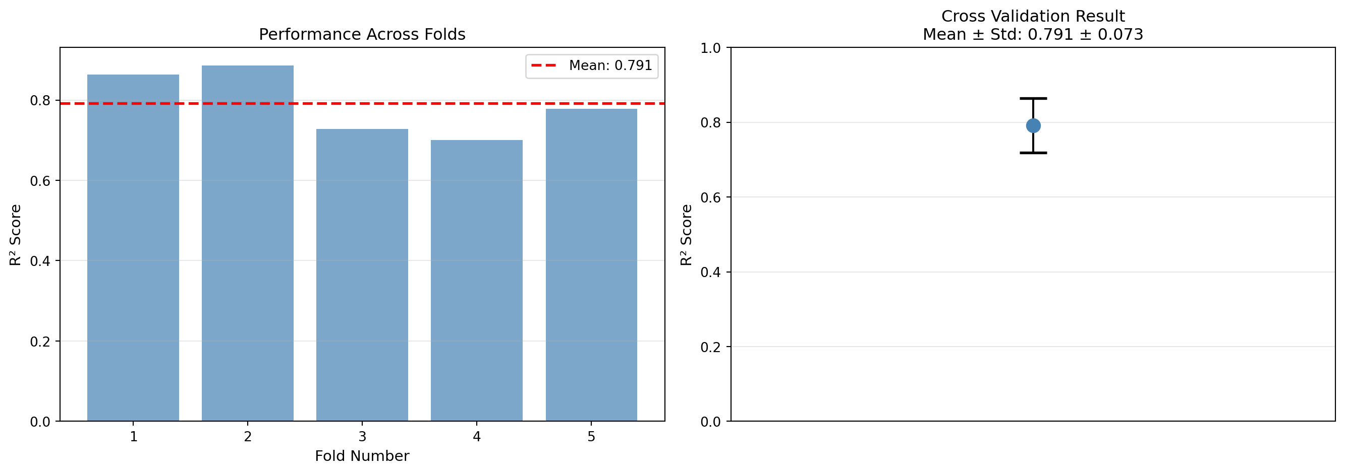
Individual fold scores: [0.86339011 0.88648888 0.72817787 0.70072669 0.77822277]
Mean CV score: 0.7914
Std CV score: 0.0730
6.6.2 Leave-One-Out Cross Validation (LOOCV)
Leave-One-Out Cross Validation (LOOCV) is a special case of K-fold cross validation where \(K = M\), the total number of samples. In each iteration, we use a single sample as the test set and all remaining \(M-1\) samples as the training set. We repeat this \(M\) times, using each sample exactly once as the test set.
The LOOCV performance estimate is:
\[P_{\text{LOOCV}} = \frac{1}{M}\sum_{m=1}^M P_m \tag{6.14}\]
where \(P_m\) is the performance when sample \(m\) is used as the test set.
Advantages of LOOCV:
- Provides an almost unbiased estimate of generalization performance
- No randomness in the train-test split (each sample is used exactly once for testing)
- Useful for very small datasets where we cannot afford to hold out many samples
Disadvantages of LOOCV:
- Computationally expensive (requires training \(M\) models)
- High variance in the estimate, since the training sets overlap significantly
- Not suitable for large datasets
In practice, 5-fold or 10-fold cross validation is often preferred as it provides a good balance between bias and variance in the performance estimate, while being much more computationally efficient than LOOCV.
6.6.3 Stratified K-Fold
For classification problems with imbalanced classes, we can combine the ideas of stratified splitting and K-fold cross validation. Stratified K-fold cross validation ensures that each fold maintains approximately the same class distribution as the original dataset. This is the recommended approach for classification tasks.
6.7 Bias-Variance Tradeoff
A fundamental concept in machine learning is the bias-variance tradeoff, which helps us understand the sources of prediction error and guides our modeling choices.
Consider a model trained on a dataset \(D_{\text{train}}\). For a new data point \(x\), the model makes a prediction \(\hat{y} = h(x)\). The true relationship is \(y = f(x) + \epsilon\), where \(f(x)\) is the true underlying function and \(\epsilon\) is irreducible noise with \(E[\epsilon] = 0\) and \(\text{Var}(\epsilon) = \sigma^2\).
The expected prediction error at a point \(x\) can be decomposed into three components:
\[E[(y - \hat{y})^2] = \text{Bias}^2 + \text{Variance} + \sigma^2 \tag{6.15}\]
where the bias and variance are defined as:
\[\text{Bias} = E[\hat{y}] - f(x) \tag{6.16}\]
\[\text{Variance} = E[(\hat{y} - E[\hat{y}])^2] \tag{6.17}\]
Bias measures how far the average prediction of our model is from the correct value. High bias means the model makes systematic errors, typically because it is too simple to capture the underlying pattern (underfitting).
Variance measures how much the predictions vary for different training sets. High variance means the model is very sensitive to the specific training samples, typically because it is too complex and fits noise in the training data (overfitting).
Irreducible error \(\sigma^2\) is the noise inherent in the problem, which cannot be reduced by any model.
The tradeoff arises because:
- Simple models (like linear regression) tend to have high bias but low variance
- Complex models (like high-degree polynomial regression) tend to have low bias but high variance
The goal is to find the sweet spot that minimizes total error. This is illustrated in Figure 6.9.
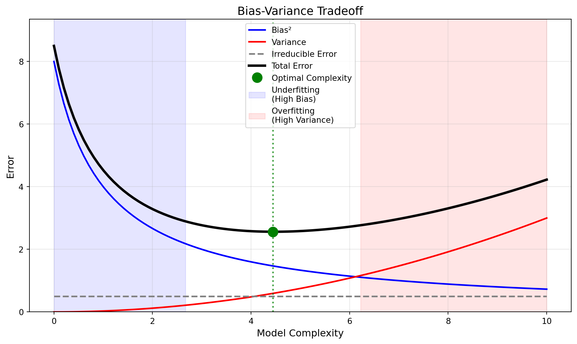
This tradeoff is directly related to the regularization techniques we saw in Section 4.3. The regularization parameter \(\lambda\) controls model complexity: small \(\lambda\) allows complex models (low bias, high variance), while large \(\lambda\) constrains the model (high bias, low variance).
6.8 Learning Curves
Learning curves are a powerful diagnostic tool that plots model performance as a function of the training set size. They help us understand whether our model suffers from high bias or high variance, and whether collecting more data would help.
A learning curve typically shows two lines:
- Training error: Performance on the training set itself
- Validation error: Performance on a held out validation set
For a model with high bias (underfitting):
- Training error is high and increases slightly as we add more data
- Validation error is high and similar to training error
- The two curves converge to a high error value
- Adding more data will not help significantly
For a model with high variance (overfitting):
- Training error is low but increases as we add more data
- Validation error is much higher than training error
- There is a large gap between the two curves
- Adding more data may help reduce the gap and improve validation error
Code
import numpy as np
import matplotlib.pyplot as plt
from sklearn.model_selection import learning_curve
from sklearn.linear_model import LinearRegression
from sklearn.preprocessing import PolynomialFeatures
from sklearn.pipeline import make_pipeline

np.random.seed(42)

# Generate synthetic data (quadratic relationship with noise)
M = 200
X = np.linspace(0, 10, M).reshape(-1, 1)
y = 0.5 * X.ravel()**2 + 2 * X.ravel() + 1 + np.random.randn(M) * 10

# Three models: underfit, good fit, overfit
models = [
    ('Underfitting (Linear)', make_pipeline(PolynomialFeatures(degree=1), LinearRegression())),
    ('Good Fit (Quadratic)', make_pipeline(PolynomialFeatures(degree=2), LinearRegression())),
    ('Overfitting (Degree 15)', make_pipeline(PolynomialFeatures(degree=15), LinearRegression()))
]

fig, axes = plt.subplots(1, 3, figsize=(16, 5))

for idx, (title, model) in enumerate(models):
    ax = axes[idx]

    # Compute learning curve
    train_sizes, train_scores, val_scores = learning_curve(
        model, X, y, cv=5, train_sizes=np.linspace(0.1, 1.0, 10),
        scoring='neg_mean_squared_error', random_state=42
    )

    # Convert negative MSE to positive and take sqrt for RMSE
    train_scores_mean = np.sqrt(-train_scores.mean(axis=1))
    train_scores_std = np.sqrt(-train_scores).std(axis=1)
    val_scores_mean = np.sqrt(-val_scores.mean(axis=1))
    val_scores_std = np.sqrt(-val_scores).std(axis=1)

    # Plot
    ax.plot(train_sizes, train_scores_mean, 'o-', color='blue', label='Training error')
    ax.set_yscale('log')
    ax.fill_between(train_sizes, train_scores_mean - train_scores_std,
                    train_scores_mean + train_scores_std, alpha=0.1, color='blue')

    ax.plot(train_sizes, val_scores_mean, 'o-', color='red', label='Validation error')
    ax.fill_between(train_sizes, val_scores_mean - val_scores_std,
                    val_scores_mean + val_scores_std, alpha=0.1, color='red')

    ax.set_xlabel('Training Set Size', fontsize=11)
    ax.set_ylabel('RMSE', fontsize=11)
    ax.set_title(title, fontsize=12)
    ax.legend(loc='best')
    ax.grid(alpha=0.3)

plt.tight_layout()
plt.show()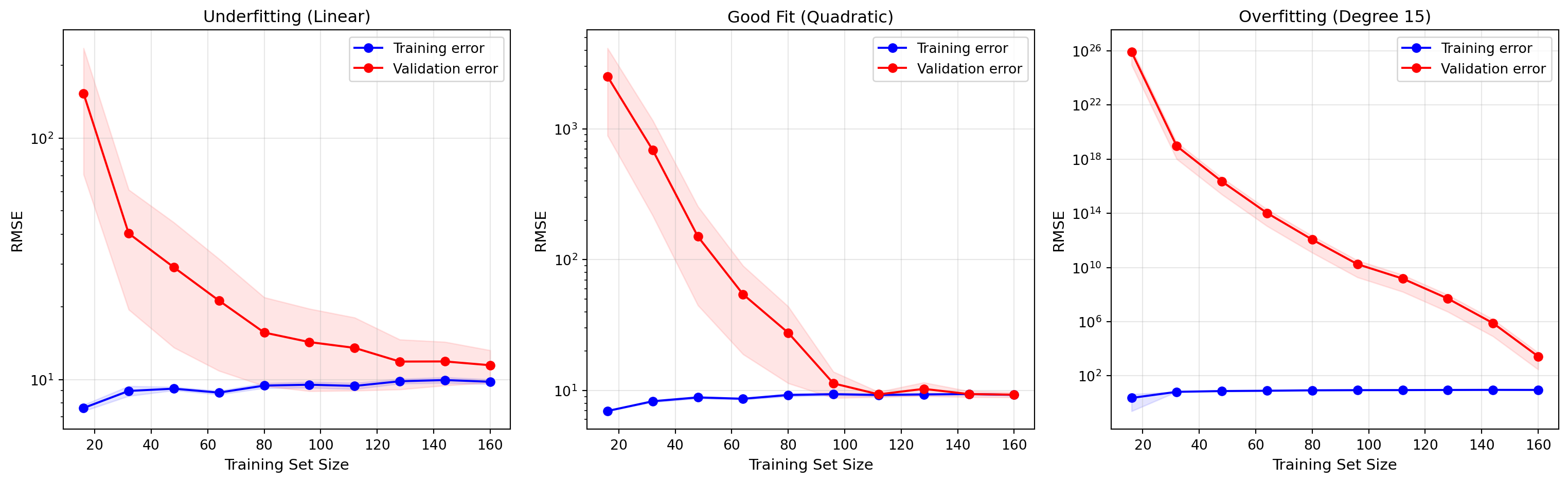
From learning curves, we can determine the appropriate action:
- If both errors are high and converged: the model is too simple (high bias). Try a more complex model.
- If there is a large gap between training and validation error: the model is overfitting (high variance). Try regularization, get more data, or use a simpler model.
- If validation error is decreasing and has not plateaued: more data may help.
Compared to other learning curves we have seen before, a key takeaway here is that overfitting happens with the wrong combination of model and data, and does not always show up in the same way.
In the last graph, we can see that a complex model can potentially still be used and good performance be obtained, even if not ideal to the problem, when enough data is available. For example, a higher degree polynomial can fit data generated from a lower degree model, if the amount of training data is large enough so that overfitting cannot occur. It is important to note, however, that this situation is not visible yet in the graph. More data would still be needed to avoid the overfitting problem, when the validation error plateaus at the same noise level as the train error.
A final note: in these graphs, the training error actually increases initially because with a very low amount of data the overfitting can fit even some of the noise in the data.
6.9 Hyperparameter Tuning
Most machine learning models have hyperparameters that are not learned from the data but must be specified before training. Examples include the learning rate \(\alpha\) in gradient descent, the regularization parameter \(\lambda\) in regularized regression, or the degree of polynomial features.
Selecting good hyperparameter values is crucial for model performance. We introduced the concept of hyperparameter tuning in Section 4.4, where we discussed grid search for polynomial regression. Here we provide a more systematic treatment.
6.9.1 Grid Search
Grid search exhaustively tries all combinations of hyperparameter values from a predefined grid. For example, if we want to tune two hyperparameters, we might define:
- Learning rate \(\alpha \in \{0.001, 0.01, 0.1, 1.0\}\)
- Regularization \(\lambda \in \{0.01, 0.1, 1.0, 10.0\}\)
Grid search would train and evaluate \(4 \times 4 = 16\) models (one for each combination). The hyperparameters that yield the best validation performance are selected.
The algorithm is:
- Define a grid of hyperparameter values
- For each combination of hyperparameters:
- Train a model using those hyperparameters on the training set
- Evaluate the model on the validation set
- Record the validation performance
- Select the hyperparameters with the best validation performance
- Retrain the model on the combined training and validation sets using the selected hyperparameters
- Evaluate final performance on the test set
Code
import numpy as np
import matplotlib.pyplot as plt
from sklearn.linear_model import Ridge
from sklearn.preprocessing import PolynomialFeatures
from sklearn.pipeline import make_pipeline
from sklearn.model_selection import train_test_split
from sklearn.metrics import r2_score

np.random.seed(42)

# Generate data
M = 100
X = np.linspace(0, 10, M).reshape(-1, 1)
y = 0.5 * X.ravel()**2 + 2 * X.ravel() + 1 + np.random.randn(M) * 10

# Split data
X_train, X_val, y_train, y_val = train_test_split(X, y, test_size=0.3, random_state=42)

# Define hyperparameter grid
degrees = [1, 2, 3, 4, 5]
alphas = [0.01, 0.1, 1.0, 10.0, 100.0]

# Grid search
results = np.zeros((len(degrees), len(alphas)))

for i, degree in enumerate(degrees):
    for j, alpha in enumerate(alphas):
        model = make_pipeline(PolynomialFeatures(degree=degree), Ridge(alpha=alpha))
        model.fit(X_train, y_train)
        y_pred = model.predict(X_val)
        results[i, j] = r2_score(y_val, y_pred)

# Find best hyperparameters
best_idx = np.unravel_index(np.argmax(results), results.shape)
best_degree = degrees[best_idx[0]]
best_alpha = alphas[best_idx[1]]
best_score = results[best_idx]

# Visualize
fig, ax = plt.subplots(figsize=(10, 7))
im = ax.imshow(results, cmap='viridis', aspect='auto', origin='lower')

# Set ticks and labels
ax.set_xticks(range(len(alphas)))
ax.set_yticks(range(len(degrees)))
ax.set_xticklabels([f'{a:.2f}' for a in alphas])
ax.set_yticklabels(degrees)
ax.set_xlabel('Regularization Parameter (α)', fontsize=12)
ax.set_ylabel('Polynomial Degree', fontsize=12)
ax.set_title('Grid Search: Validation R² Score', fontsize=13)

# Add colorbar
cbar = plt.colorbar(im, ax=ax)
cbar.set_label('R² Score', fontsize=11)

# Annotate cells with values
for i in range(len(degrees)):
    for j in range(len(alphas)):
        text = ax.text(j, i, f'{results[i, j]:.3f}',
                      ha="center", va="center", color="white", fontsize=9)

# Mark best result
ax.plot(best_idx[1], best_idx[0], marker='*', color='red', markersize=20)

plt.tight_layout()
plt.show()

print(f"Best hyperparameters: degree={best_degree}, alpha={best_alpha:.2f}")
print(f"Best validation R² score: {best_score:.4f}")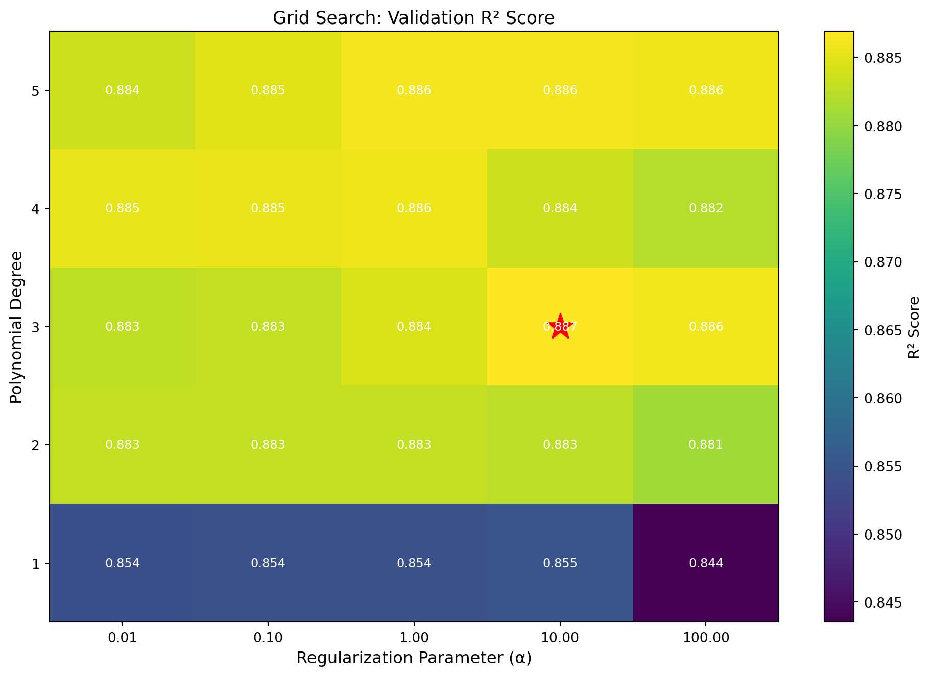
Best hyperparameters: degree=3, alpha=10.00
Best validation R² score: 0.8869
6.9.2 Cross Validation in Grid Search
When using grid search, it is important to combine it with cross validation to get more robust performance estimates. For each hyperparameter combination, we perform K-fold cross validation and use the average cross validation score to select the best hyperparameters. This approach is more reliable than using a single validation split, especially for small datasets.
6.9.3 Nested Cross Validation
If we want an unbiased estimate of the final model’s performance, we should not use the test set for hyperparameter selection. However, using cross validation for both hyperparameter tuning and final performance estimation requires care. Nested cross validation solves this problem by using two nested loops:
- Outer loop: K-fold cross validation for performance estimation
- Inner loop: For each outer fold, perform grid search with cross validation to select hyperparameters
This ensures that the test set in each outer fold is never used for hyperparameter selection, providing an unbiased performance estimate.
6.10 Summary
In this chapter, we have covered the essential practical aspects of supervised learning:
Performance metrics: How to measure model quality using metrics like accuracy, precision, recall, F1 score for classification, and MAE, RMSE, \(R^2\) for regression.
Data partitioning: How to split data into training, validation, and test sets to enable unbiased model evaluation and hyperparameter tuning.
Cross validation: How to use K-fold cross validation and LOOCV to get more reliable performance estimates, especially with limited data.
Bias-variance tradeoff: How to understand the sources of prediction error and diagnose whether a model is underfitting or overfitting.
Learning curves: How to use training and validation error curves to diagnose model problems and decide whether more data would help.
Hyperparameter tuning: How to systematically search for good hyperparameter values using grid search combined with cross validation.
These concepts and techniques apply across all supervised learning models, from the linear and polynomial regression we studied in earlier chapters to the neural networks, support vector machines, and decision trees we will explore in the following chapters. Mastering these tools is essential for successfully applying machine learning in practice.